Box sizes
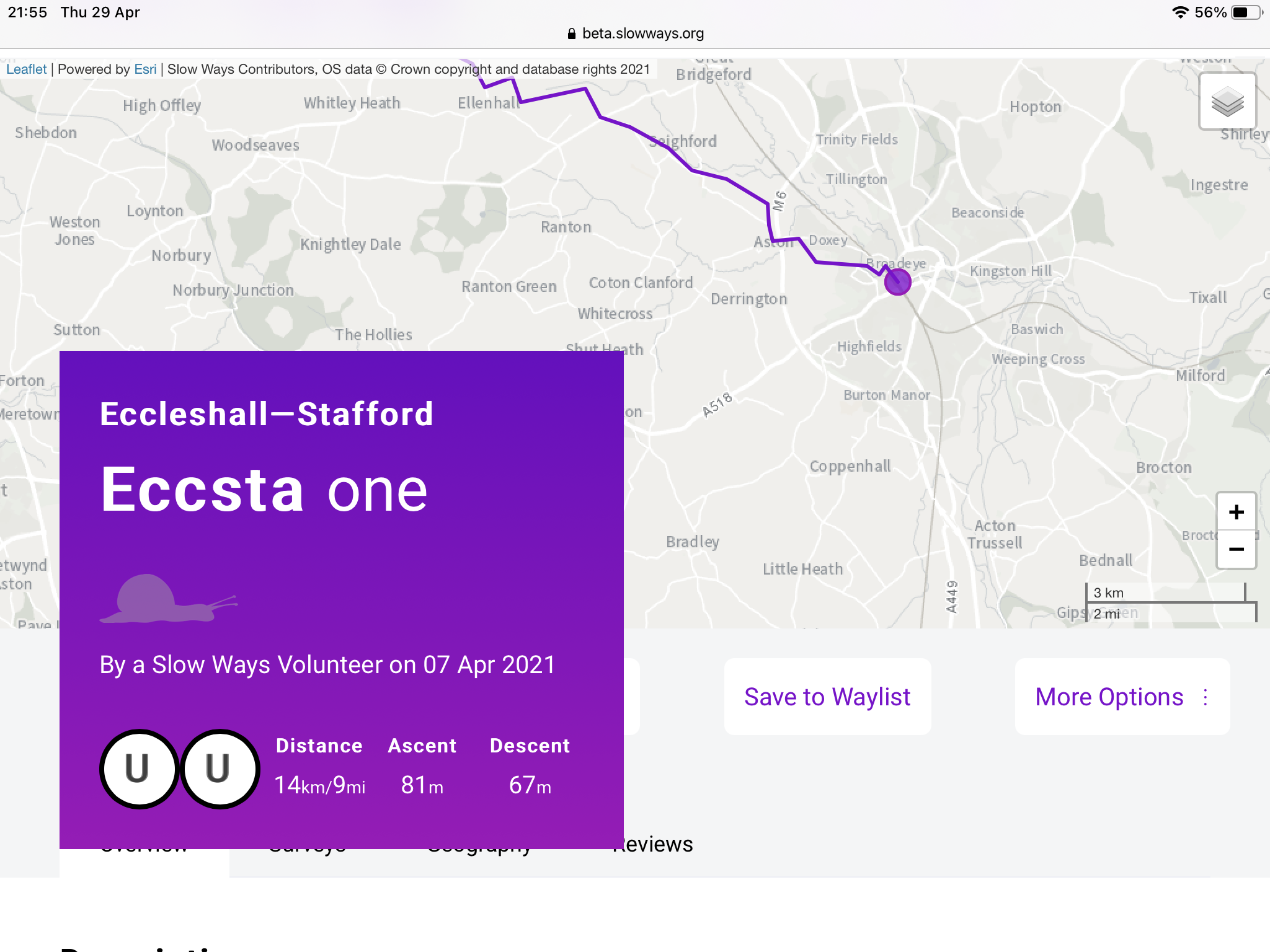
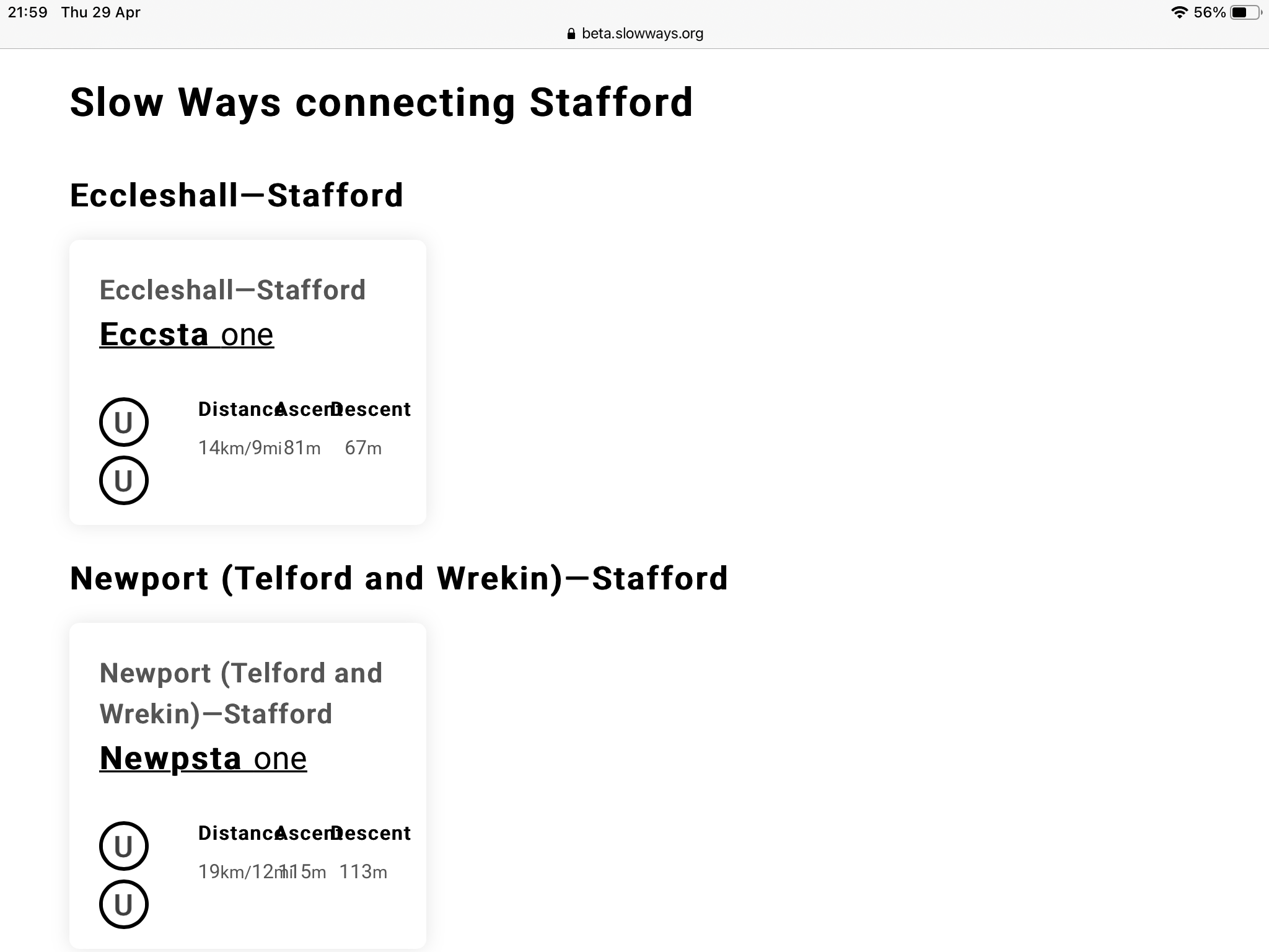
On an iPad I’m finding that the purple route box obscures the tabs underneath and also the download .gpx button. Also the route boxes when choosing a route have squashed the “distance” “ascent”and “descent” labels so they overlap and are difficult to read.
if would be useful to be able to move, or resize, the purple box. I guess the route boxes have to be constrained so perhaps a different font choice?

0
Please sign in to leave a comment.
Comments
0 comments